 An image with a high saturation makes an intense impact on the overall image and a more bold appearance to the audience. The saturation can also be described as the colour intensity.
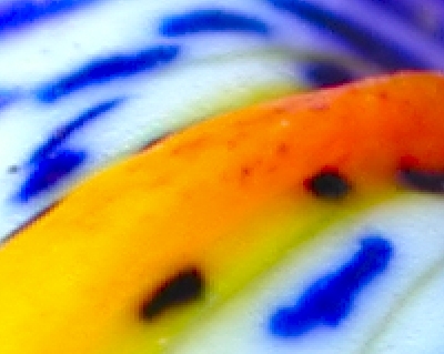
 Bold colours can be used to grab the attention to the overall image or just to make a bold statement within the image. This can effect is different depending how they are used. Images with bright bold colours generally make for a joyful looking image whereas maybe bold reds and blacks can create a more dangerous looking image.
It is not how light or dark the colour is but how bold or pale the colour is and it is not often that all colours in an image will be bold saturated colours.
Mixing a palette of saturated and desaturated hues makes for a more subtle and interesting image to view.
No comments:
Post a Comment